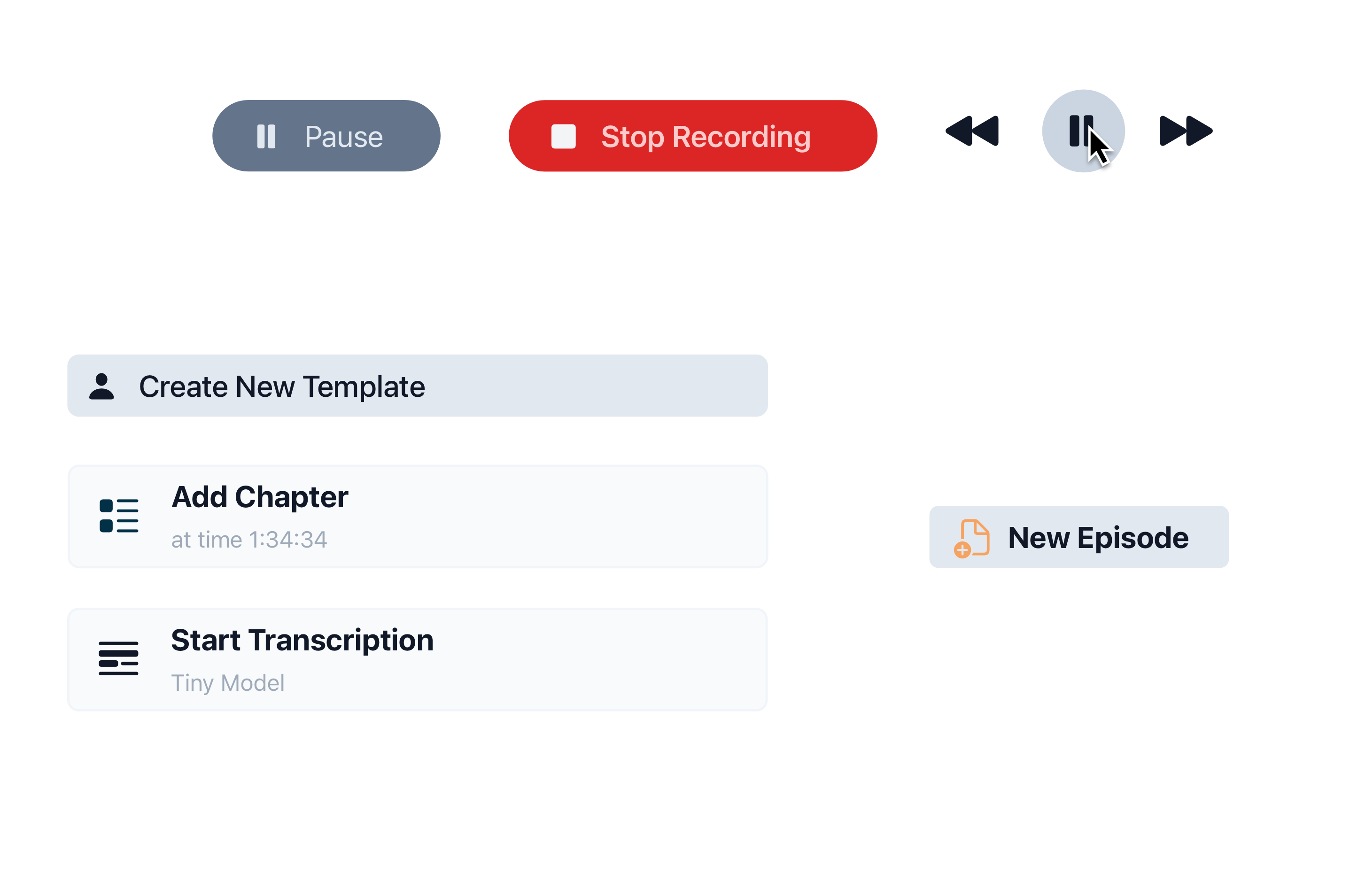
Default Ways to Create Buttons in SwiftUI
While there isn’t a single “default” way to create buttons in SwiftUI, there are several common methods for handling user interactions, much like buttons. Let’s explore two of the most popular approaches.
Button Structure You can create a button within the body variable using the Button structure, which includes a label and an action handler.
Button {
   // Do some actions
} label: {
   Text("Confirm")
     .padding()
}
Here is the more ways to create Buttons
On Tap Action This approach allows you to add an action handler to any view, not just buttons. It also provides control over the number of taps required to trigger the action.
EpisodeToolbarView(interactor: interactor)
   .padding(.top, 8)
   .padding(.horizontal, 16)
	 .onTapGesture(count: 1) {
      // Do some actions
	 }
Both of these methods are excellent for creating simple, standard buttons.
How to Customize a Button with Button Style
By default, the Button structure uses a tap style with opacity, which is simple, safe, and works well in most cases. However, if you need custom tap behavior, SwiftUI offers the ButtonStyle protocol. This allows you to override the button’s style, not only for the tap action but also for hover actions.
Let’s create a simple yet elegant style with a scale animation on tap.
struct HeadroomScaleButton: ButtonStyle {
    func makeBody(configuration: Configuration) -> some View {
        configuration.label
            .padding(.top, configuration.isPressed ? 1 : 0)
            .padding(.bottom, configuration.isPressed ? 0 : 1)
            .contentShape(Rectangle())
            .scaleEffect(configuration.isPressed ? 0.98 : 1.0)
            .animation(.easeInOut, value: configuration.isPressed)
    }
}
To use this style, apply a modifier to override the button’s default style with your custom style.
Button {
   // Do some actions
} label: {
   Text("Confirm")
     .padding()
}
.buttonStyle(HeadroomScaleButton())
Buttons in Headroom
In Headroom, we occasionally use a scale button style, but we have specific requirements for buttons that go beyond this.
Hover Effect
When a user hovers over a button with a pointer, we want to highlight the element to indicate it’s interactive.
Action Effect
We also need to provide feedback to users about their interactions. In Headroom, this feedback is typically given through color changes. Let’s update our button to use different foreground colors depending on the button’s state.
Button {
    // Do some actions
} label: {
    Text("Confirm")
        .foreground(
            normal: .gray,
            hover: .blue,
            onClick: .brown
        )
        .padding()
        .background {
            RoundedRectangle(cornerRadius: 8)
                .foreground(
                    normal: .clear,
                    hover: .accentColor,
                    onClick: .indigo
                )
        }
}
As you can see, we’ve added a custom modifier to set colors with a single call.
Custom View Modifiers
Another powerful feature of SwiftUI is view modifiers. These allow you to modify a view with a simple, standardized API, at least within your project.
Here’s our color modifier:
private struct InteractionColorsButtonModifier: ViewModifier {

    let defaultColor: Color
    let hoverColor: Color
    let clickColor: Color

    @Environment(\.buttonClickFlag) private var onClick
    @Environment(\.buttonHoverFlag) private var onHover

    func body(content: Content) -> some View {
        content
            .foregroundColor(onClick ? clickColor : (onHover ? hoverColor : defaultColor))
            .animation(nil, value: onClick)
            .animation(nil, value: onHover)
    }
}
And the extension for the view. With this, we can apply the modifier to any View in our project.
extension View {
    func foreground(normal: Color, hover: Color? = nil, onClick: Color) -> some View {
        modifier(InteractionColorsButtonModifier(defaultColor: normal, hoverColor: hover ?? normal, clickColor: onClick))
    }
}
Currently, this just replaces the foregroundStyle() API with two additional colors, which we’re not using yet.
Environment Values
To provide information from our button to the modifier about user interactions, our modifier needs to be aware of the button states. The view using this style should be a label of the button.
This is where Environment Values come in. This approach allows us to pass information from a parent view to its children.
We need to declare and implement two environment values for hover and action states:
private struct hoverKey: EnvironmentKey {
    static let defaultValue: Bool = false
}

private struct clickKey: EnvironmentKey {
    static let defaultValue: Bool = false
}

extension EnvironmentValues {
    var buttonHoverFlag: Bool {
        get { self[hoverKey.self] }
        set { self[hoverKey.self] = newValue }
    }
    var buttonClickFlag: Bool {
        get { self[clickKey.self] }
        set { self[clickKey.self] = newValue }
    }
}
Final Implementation
Now, we can combine everything: the button style and the foreground modifier for the button’s label. This setup allows us to change the label’s color based on interaction states, providing visual feedback to the user.
struct HeadroomStyledButton: ButtonStyle {

    @State private var hovering: Bool = false

    func makeBody(configuration: Self.Configuration) -> some View {
        configuration.label
            .onHover { hovering in
                self.hovering = hovering
            }
            .environment(\.buttonClickFlag, configuration.isPressed)
            .environment(\.buttonHoverFlag, hovering)
    }
}
That’s all, folks!
We’ve successfully implemented custom button styles and modifiers to enhance the user experience in Headroom.
